Client
Mercuria

Overview
Working collaboratively with stakeholders and developers, I redesigned Mercuria’s website with a focus on improving navigation, simplifying dense content and elevating the visual identity. My role spanned UX research, wireframing and UI design, ensuring the final experience aligned with the brand’s international scale and professional tone.
Client
Mercuria
Industry
Energy and Commodity Trading
Service
UX/UI Design
Brand Design
Duration
4 Weeks


The Challenge
The original site presented users with large volumes of content but lacked a clear structure and visual hierarchy, making it difficult for visitors to understand the company’s offering or find specific information. The design also didn’t reflect Mercuria’s innovative and global position in the energy market.
The Solution
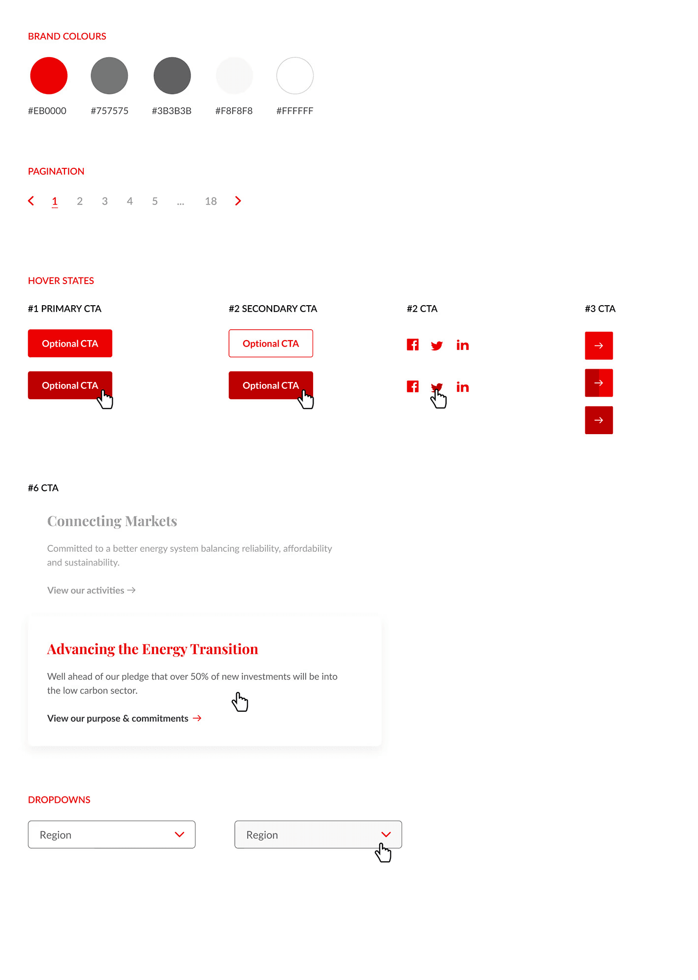
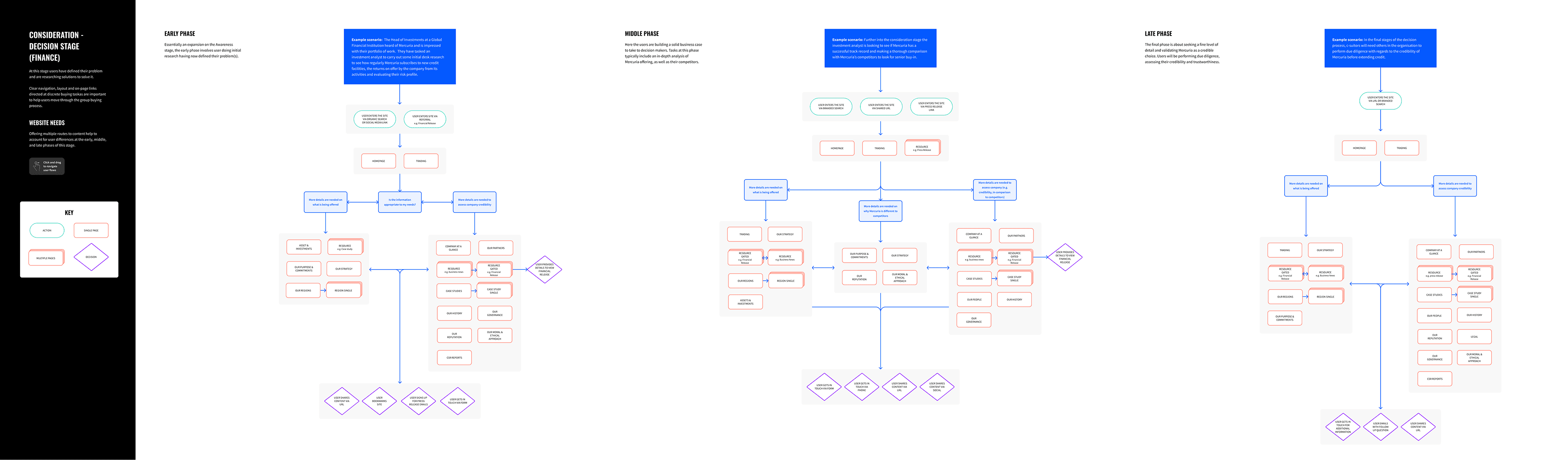
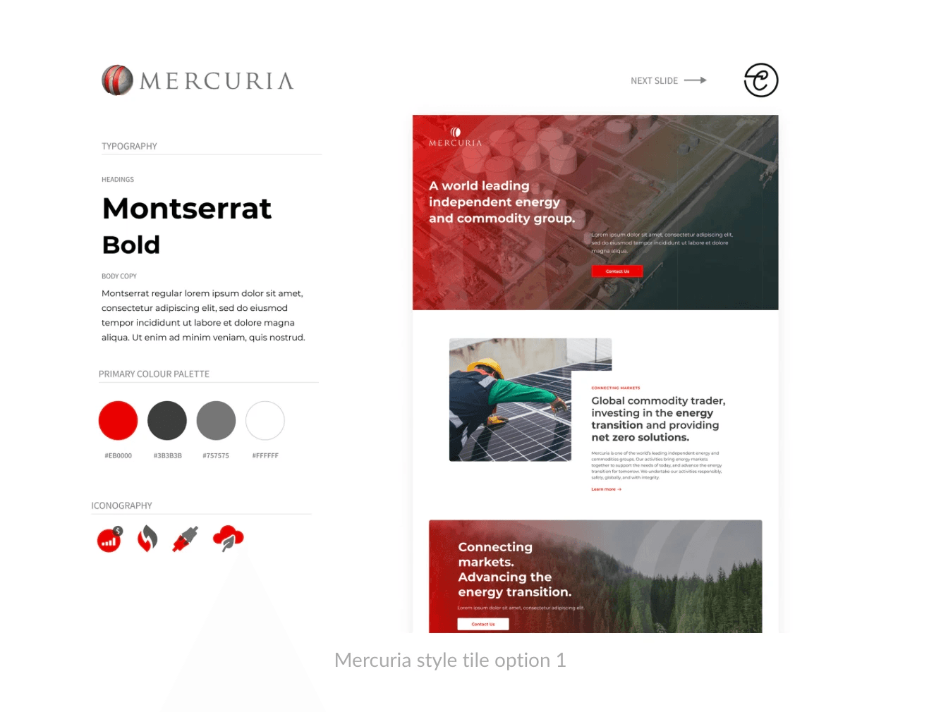
Through a UX audit and competitor analysis, I identified ways to streamline content and introduce clearer pathways for users. I created a refined visual system and introduced interactive components to help guide users through key areas such as operations, sustainability and leadership. The design focused on clarity, consistency and responsiveness, and I worked closely with developers to ensure smooth implementation.

The Result
The redesigned website significantly improved clarity, engagement and overall usability. Visitors were able to locate key content such as corporate reports and sustainability information more efficiently, contributing to a 40% drop in bounce rate. The modernised design led to a 25% increase in page views per session, while stakeholder feedback praised the new site for better reflecting Mercuria’s innovation, scale and global credibility.