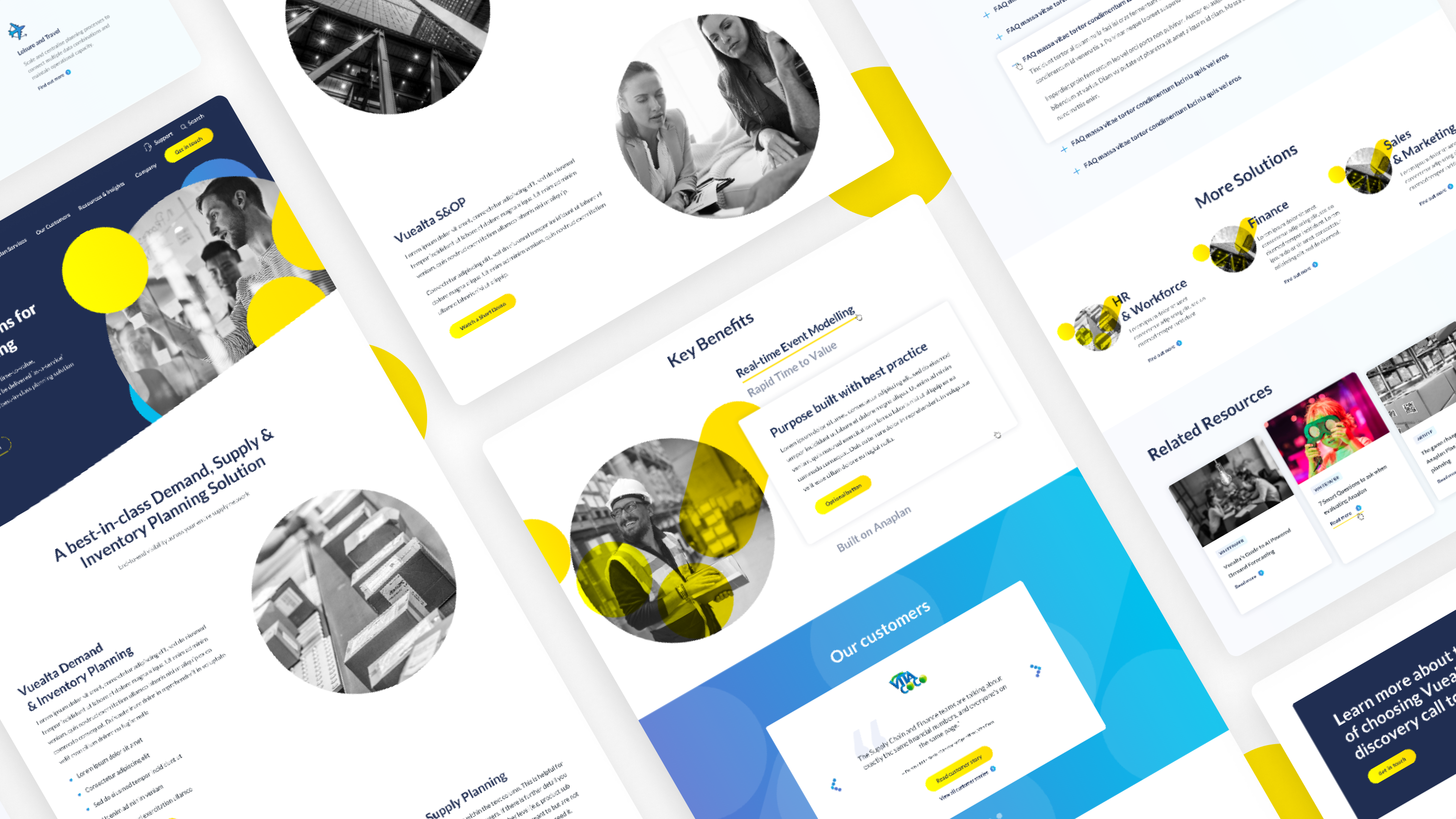
Totogi website redesign
The monetisation platform for Telecom.
Role: lead digital designer (UX/UI)
Project key goals
1. Highlight Totogi's bold and distinctive new brand proposition.
2. Showcase the extensive range of products to emphasise the variety available to customers.
3. Expand awareness of Totogi within the target market.
4. Enhance user experience, streamline site navigation, and optimise calls-to-action (CTAs).
5. Boost lead generation and facilitate the conversion of leads into the sales pipeline.
Overview
Created a website with a UX centric approach, SEO optimisation, and lead generation, positioning Totogi as a market leader. This customer-centric site will be at the core of future global marketing and growth efforts.
The deliverables output I was responsible for included:
✅ A sitemap
✅ Key user journey flow diagrams
✅ A content map
✅ Detailed UI designs, implementing Mercuria’s updated design system
✅ QA testing
01
Discovery
We started by identifying the brand’s vision and defining the target users. Regarding the users I was pleased to discover that Totogi already had a lot of insight into their target audience so it was a matter of consolidating the findings in a UX design questionnaire format. This information gave me a better understanding to ensure we created a new experience that was focused around the users’ needs whilst streamlining the navigation.
This followed with us creating a sitemap and producing user flows on Figma to understand the consumer’s journey throughout the stages of the buying process which helped to propose where CTAs should be best placed on the new site. When proposing this new site structure, using Slickplan, I consulted the SEO team to ensure it was optimised for SEO which would help expand the awareness within the target market.
Totogi sitemap
Consideration-Decision stage - User flows
The next step was to produce a content map. Content mapping was an important stage to ensure the modules we were suggesting would cater for the content that the client was providing. I’d also provided examples from existing sites that really helped the client visualise what the modules could potentially look like.
This really helped to progress through the wireframes rapidly as the client had provided a lot of feedback in the content map which was taken forward and implemented in the wireframes. There was also careful consideration for on page content to boost lead generation, providing on page forms to facilitate the conversation of leads into the sales pipeline.
Totogi wireframes
02
Design
Before getting started on the UI designs, I collaborated closely with a fellow design team member. Together, we helped to consolidate Totogi’s brand direction with the CEO. I designed the homepage design first to confirm the client was happy with the design direction. I had prototyped some micro animation on the homepage to show both the client and developers my proposal to enhance the user interface.
Totogi style tile
I had prototyped some micro animation on the homepage to show both the client and developers my proposal to enhance the user interface.
Prototyping in Figma
Following this I designed the inner page designs. Before presenting any designs to the client I was consistently communicating with the developers to make sure they were also happy with the designs I had created and there were no issues with the responsiveness of the designs for mobile.
In this project there were several of iterations of the designs to ensure we had really captured the vision from the CEO of the company. Whilst this was more time consuming, and took longer than anticipated it was crucial to nail this to make sure that we were not only designing for the user and business needs but also creating designs that fitted the content.
In this project there were several of iterations of the designs to ensure we had really captured the vision from the CEO of the company. Whilst this was more time consuming, and took longer than anticipated it was crucial to nail this to make sure that we were not only designing for the user and business needs but also creating designs that fitted the content.
Once the site was developed, we proceeded to test the site to ensure that the developed site had a seamless user experience and matched up with the initial designs in Figma.
Final iteration of designs on Figma
In addition to creating the UI designs, I also created a library of iconography for the client to use and some additional graphics using Adobe illustrator to visually aid their content.
Overall I feel this website redesign has been really successful, meeting the key project goals including promoting lead generation content and showcasing the extensive range of products Totogi has to offer.
Overall I feel this website redesign has been really successful, meeting the key project goals including promoting lead generation content and showcasing the extensive range of products Totogi has to offer.
Responsive mobile website designs
