Logistics UK training microsite
Logistics UK is one of the largest trade associations in the UK, with members moving goods by road, rail, sea, and air. They offer their members critical services, support, advice and access to training.
Role: lead digital designer (UX/UI)
Project key goals
1. Update & improve the UX design of the training section of the site so users find it easier to find and book their training course online.
2. Build on Wordpress so site is easier to maintain
3. Investigate addition of e-commerce/basket functionality
Overview
The existing website aimed to organise training into three sections: homepage, category page, and course detail page. Despite the seemingly straightforward hierarchy in theory, the execution was inconsistent and confusing for users seeking training. Our goal was to enhance the user journey on the training site, simplifying the process of finding and booking courses online.
As the company acquired other entities and their sites over time, various sections were organically built and released on different CMS platforms. The ultimate objective is to consolidate these elements onto a unified WordPress platform, aligning the UX/design more closely with established guidelines.
The deliverables output I was responsible for included:
✅ A sitemap
01
Discovery
Logistics UK had extensive information about their users, I was led several calls with the client to find out as much as I could to understand the different user groups and their needs. It was important that I was able to differentiate between the two priority users, members and non-members. After I'd gained clarity on this, it my responsibility to put together a sitemap and user flows that catered for these needs so that the users could easily find and book courses online.
Logistics UK sitemap
Logistics UK User Flows - Members
Logistics UK User Flows - Non-Members
Due to the in-depth immersion I had with the client to understand their users, there were very little amends that needed to be made to the user flows. The next step was to put together a content map to suggest the structure of each template and ensure the modules i'd put forward to the client catered for their proposed content.
Following on from this, the next step in the process was the creation of the wireframes. As a result of mapping out each template in the previous stage, the wireframes were produced rapidly. There were however, still some internal discussions within the organisation around the structure of the courses which made my job challenging at times. It became apparent that there would be a duplication of content if courses were separated out. After discussions with the client, I suggested the solution to combine courses together into one course finder where the user would be able to search all courses and created a second iteration of wireframes. This proved to be a simple way that would enhance the UX on the site, meeting one of the key project goals.
Logistics UK second iteration of wireframes on Figma
02
Brand
The company's in-house marketing team had reservations about refreshing their brand. I assured them that these would be minor changes that would align better with the company's brand traits. They wanted the brand to convey the feeling of being established yet dynamic and accessible. I took these traits and provided visual examples of UI elements that portrayed these in the mood boarding stage and presented these to the client on Figma. This was really helpful to align the stakeholders views and agree on what they liked/disliked.
Mood boards on Figma
Taking on board the client's feedback, I moved on to creating two variations of scamps that demonstrated to the client the application of the visual elements that were pulled out in the mood boars. I wanted to provide two different options that gave a very different look and feel. It was agreed that the first scamp was their preferred branding direction with some visual queues taken from the other scamp. Before I'd presented these to the client, I had also collaborated with my fellow design team members to gain some feedback and further developed these two routes.
V1 design scamp
V2 design scamp
Once the direction of the brand had been established, i'd created a finalised style tile that provided a foundation to be able to set up a design system that was implemented on Figma in the design phase. The process of ideation and creating style tiles significantly contributed to establishing a dynamic, established and accessible brand identity, setting a definitive design direction before the actual design process commenced.
03
Design
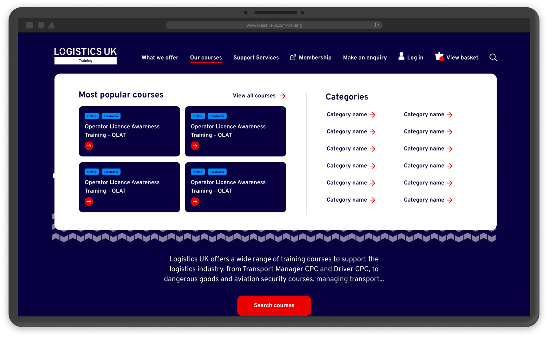
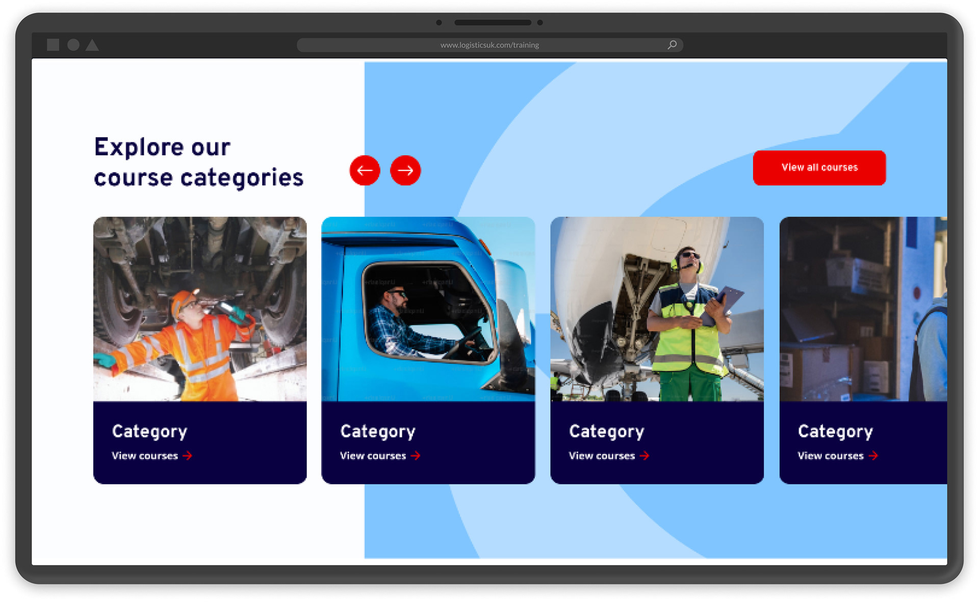
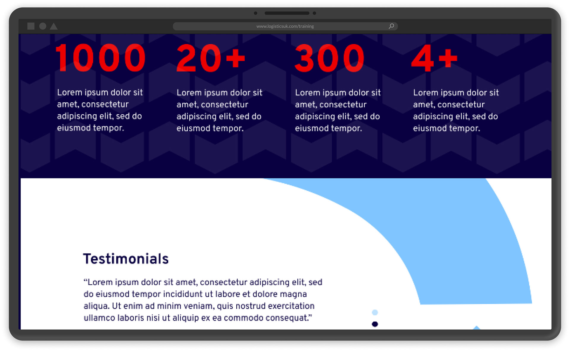
Using the design system, I created detailed UI designs that had a consistent and stronger brand identity to what they previously had. Where possible I sought feedback from other members of the design team in collaborative sessions weekly throughout.
The homepage design was shown to the client first before proceeding with the inner pages. This was to make sure the client was happy to sign off on the proposed design direction.
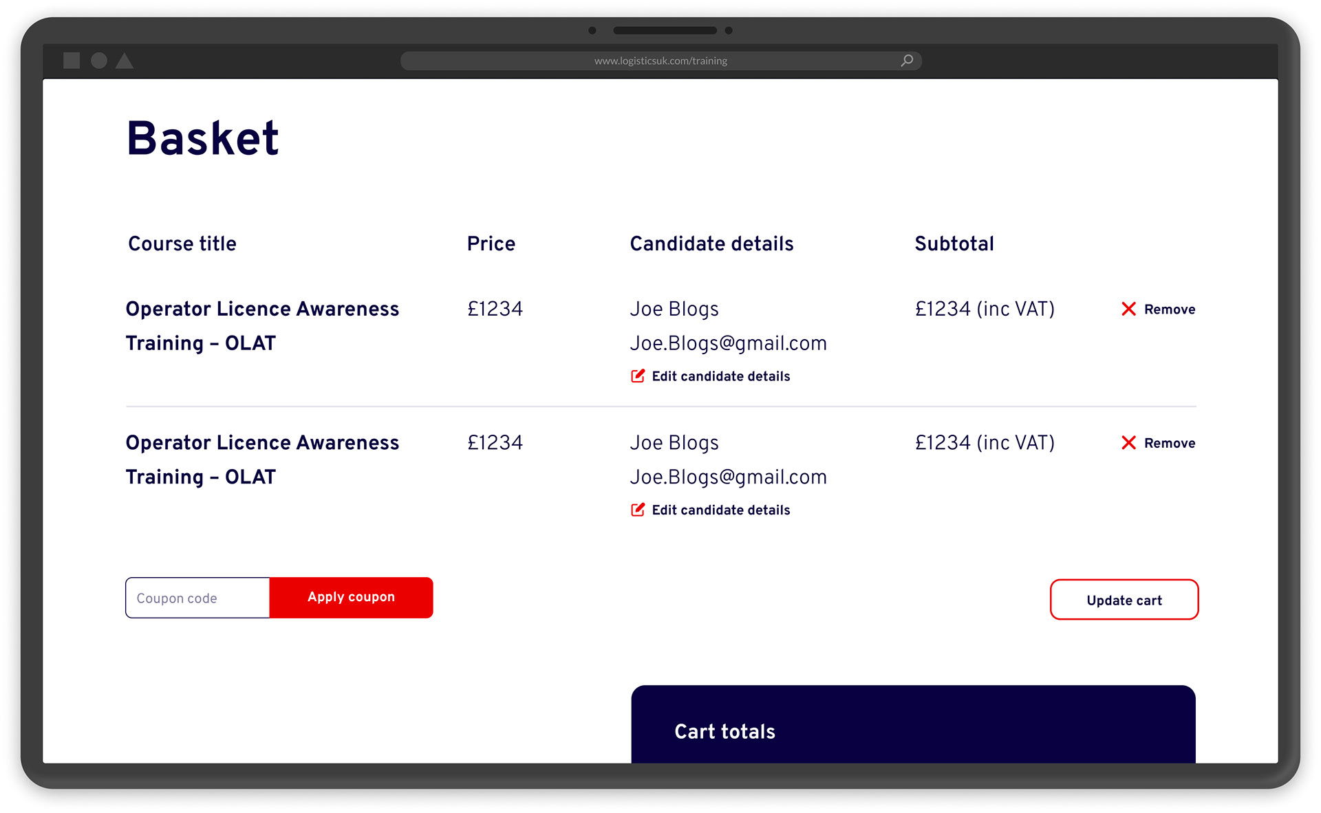
Logistics UK designs on Figma
The basket functionality had been scoped out in discovery and after I'd been having discussions with their in-house developer who I worked closely with throughout the project it was agreed that this would be a reskin of the current basket format they were using as there would be some design limitations to what could be created for the basket.
The design process ran smoothly with minimal amends and very positive feedback from Logistics UK. I also created responsive designs for mobile to show their in-house developer how certain modules should adapt on a smaller screen.
